
Today we have switched on the new look of the merchant’s Control Center.
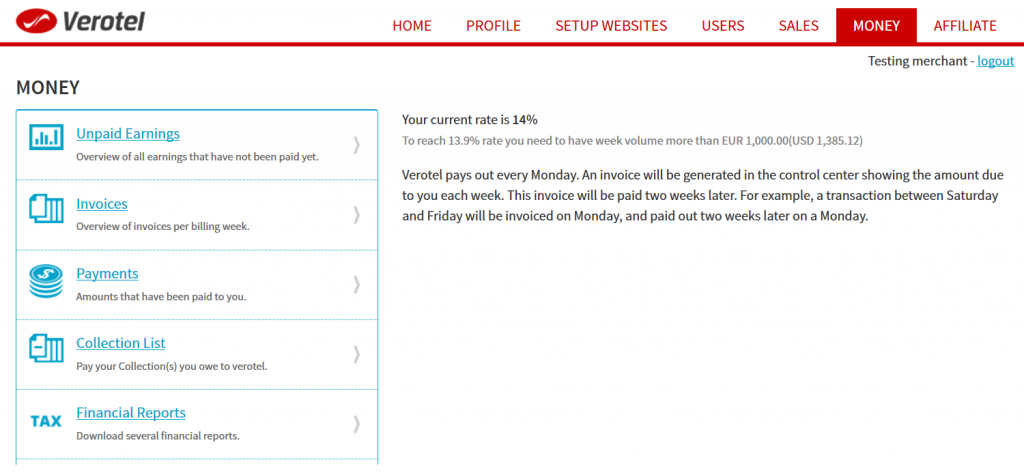
We keep working on streamlining the Control Center and making it easier for you to find all that you need. With this release we have refreshed all of the Control Center pages to give it a new, clean, consistent and modern look which also matches the Verotel website style.
Let us know what you think or if you discover any issues.
About the new style. New style attractive and modern. But Font in the user table does not look clear. Blue frame can not be combined with red menu. It would be better gray or pink color.
Alex